This...
...from start to finish
The plan
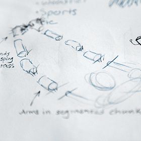
The first thing I did was plan out the shot. I made a quick sketch of approximately what I was looking for and did a quick test shot using my own hands on my desk at work. I grabbed a stock photo of an orange from sxc.hu for the filling.
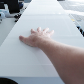
The test came out nicely, especially given how haphazardly I shot my hand and twisted the stock photo into place. Granted, there were mistakes. I channeled my inner JJ Abrams and hid them behind blurs and lens flares.
Since I was satisfied with the test, I decided to move foward with the actual shoot. I still needed to find someone to pose for me though.
The Model
I asked a bunch of my friends on facebook if they'd model for me. One person volunteered, and he didn't live in the same city as me. My friends are wusses.
Since I found no leads with my friends, I decided to go the professional route. I posted a small ad on ModelMayhem saying I needed a non-nude model for a surreal shoot. I got a few responses, and eventually went with the lovely Diana Oliphant as she had the look I was going for.
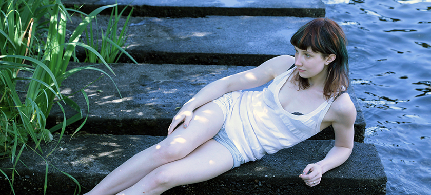
She had a very even, pale complexion. When you're doing photomanips, the less detail you have to worry about faking the better. I cheated a few times during the editing and used a simple paint brush to add in skin. I couldn't have done that with someone who had hairy, pore filled, or freckled skin. It'd look out of place. The even complexion was going to make life easier for me, and it would distract less from the focus of the art.
She also had a great neutral face. I didn't want her expression to distract from the edits, so it worked out great.
The shoot
I originally had planned the shoot to be on Saturday the 6th of July, but due to schedualing issues we moved it to Sunday. I was kind of bummed out, because the weather on Saturday was deliciously overcast, which would have made the lighting deliciously even (which would have made my life much easier later on when I had to edit the photos). When Sunday came around, the sun was in full force. A few of the shots came out overexposed.
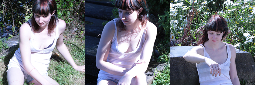
The overexposer really shows my inexperience as a photographer, but on the bright side (pun intended) at least I'll walk away from this having learned something.
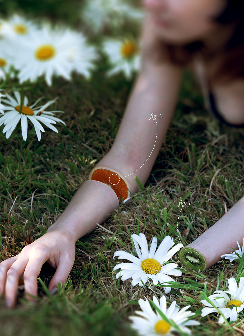
To set up the shots the first thing we did was use dental floss and eyeliner to create even circles around the model's appendages.
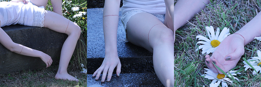
These would be used later so I could get a clean, even cut in photoshop. Real world guidelines are always helpful, and can often be easily edited out. Use them liberally, even if you think you might not use them. You'll always be surprised with how helpful they are.
Once Diana nailed a pose, we'd mark the cutoff points with sticks so we could line up the citrus and other fruits. The sticks ended up not being entirely necessary, as we only needed the fruit to be in the general area and direction as the cuts to capture the same lighting.
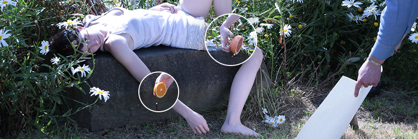
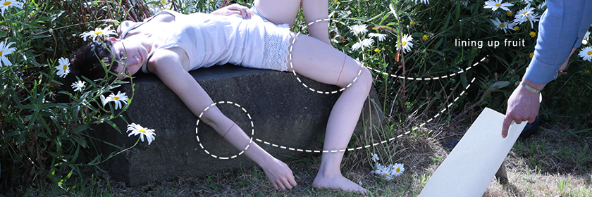
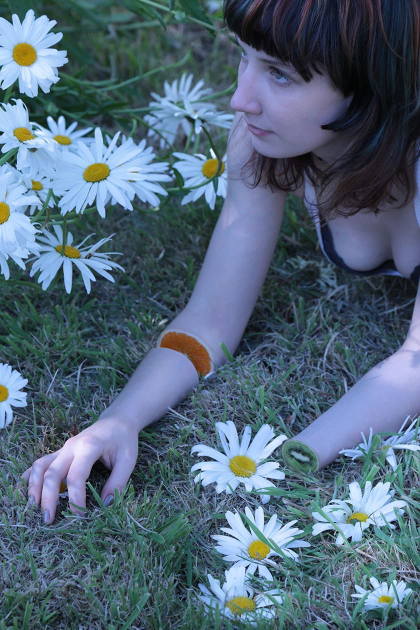
In the end I went with more of a closeup shot. I really wanted to be able to see the details of the vesicles in the oranges, so getting in close was a must. The one shot that stood out only had one major problem: cleavage.
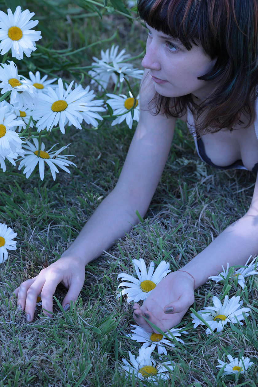
Cleavage is usually a good thing - let's get that out in the open. But it also can be very distracting for the user. Had I not used any depth of field tricks or cropping, the final image would have had four focal points: the face, the boobs, the left arm cut, and the right arm cut. Since I wanted the focus to be directed towards the cuts, I knew that I'd have to remove the focus from the face and the chest. It was a real shame too, because I really enjoyed the composition of the uncropped shot.
The shop
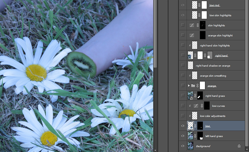
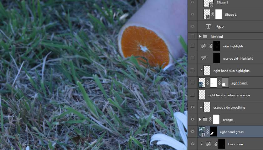
Once we had the images finalized, it was time to bring them into my playground, my muse, my addiction: photoshop. In the end I only had 24 layers, which is actually quite small. For shops like these, I usually end up with around 80 or so. My record is 943. Here's an overview of what my layer window looked like. Notice that there's no blur or crop in the composition - that always comes at the very last step.
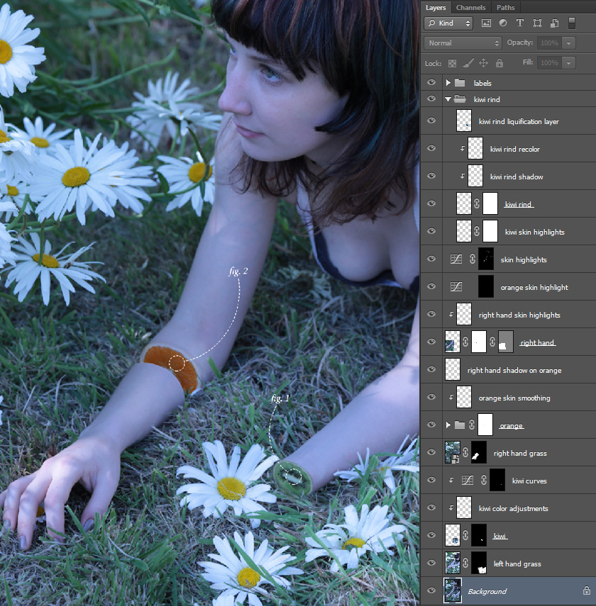
A measely 24 layers is pretty lightweight, but can still be intimidating for someone new. I'll walk through them one by one. The first thing I did was add some grass over the top of the left hand to remove it. I then added a layer mask to my grass to help it blend in more. If you hover over the image below, you can toggle the layer mask on and off.
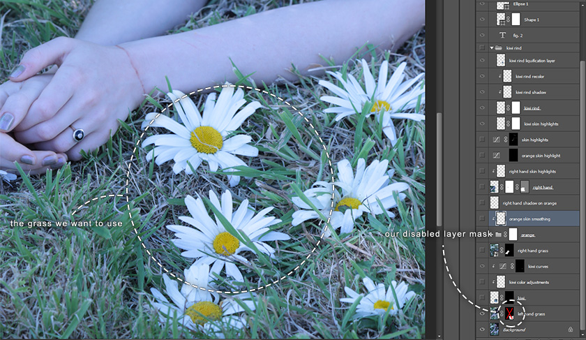
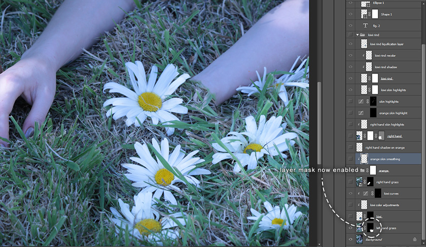
When you're toggling between the two, you'll notice that the grass doesn't always line up perfectly. Sometimes there's transparent bits overlapping. That's fine for the most part - grass is pretty noisy and a lot of those errors will get lost in that noise. We're also going to be blurring this later, so I'm not too worried. I did make sure that none of the flower petals were overlapping though. The stark white will draw the eyes to them, so we have to make sure those are squeeky clean.
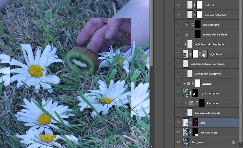
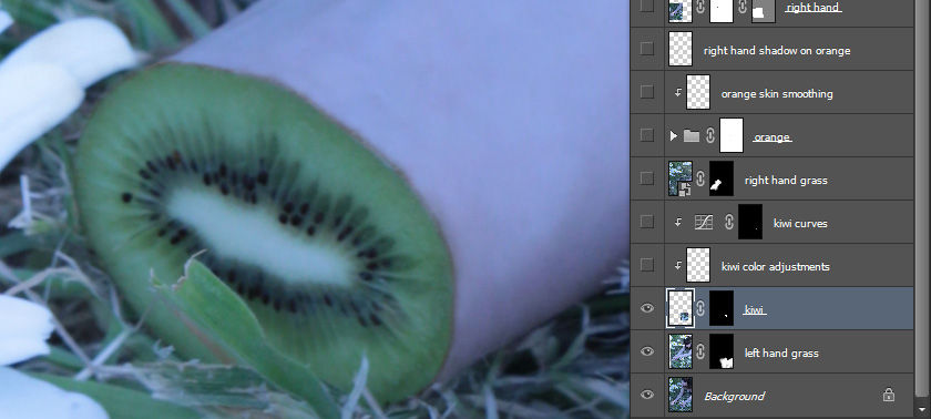
The next thing I did was add in the kiwi overlay. Again, you can hover over to enable/disable the layer mask.
Once the kiwi is in place, we need to make sure the coloration is correct. The rind of the kiwi is a dark brown, whereas our skin is almost a pale pinkish blue. To fix this, I'm going to use two separate clipping masks. A clipping mask if you aren't familiar is a layer that only affects its parent layer. If we have clipping masks on this kiwi, it will only change the kiwi and nothing else around it. This heirarchy is denoted by the indentation in the layer window. To create a clipping mask, just right click on any layer and select, "create clipping mask", and it will become a child of the layer below it.
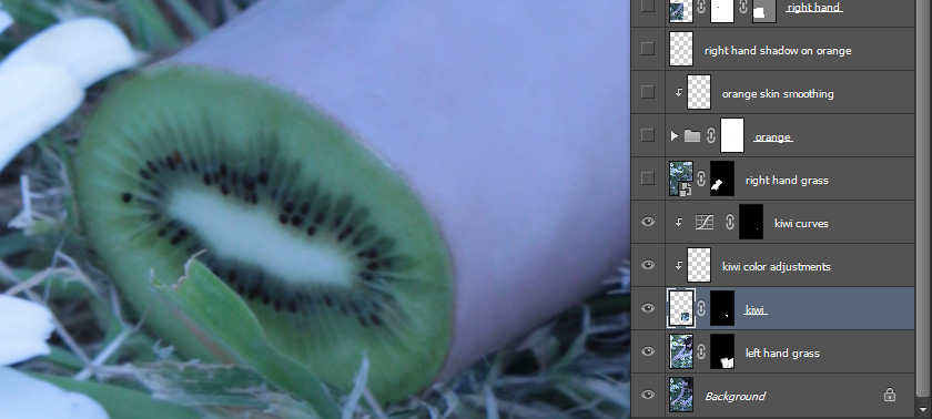
The first clipping mask we're using is one that will help us make that rind match the color of the skin. I sampled the color of the skin, then used a brush tool to draw over the rind. This alone wont help us, as it'll just look like you painted a color on, but if we set our layer mode to "color" it will work like a charm.
The second clipping mask we're using is a curve adjustment layer. I wont dive into how to use curves here, but if you aren't familiar you should really learn how to use them. They offer a lot of flexibility, and when combined with a layer mask and/or a clipping mask can offer extremely precise amounts of control. This particular curve layer is lightening the entire kiwi. I then used a layer mask on the curve layer so that we'd only be lightening the kiwi rind. Lightening the rind will help it blend in with the skin more, giving it a much more natural transition between the fruit and the arm. Hover over the image below to toggle our two clipping masks on and off.
We'll repeat that same exact same process with the right arm. Go ahead and hover over the image below to make our model a double amputee.
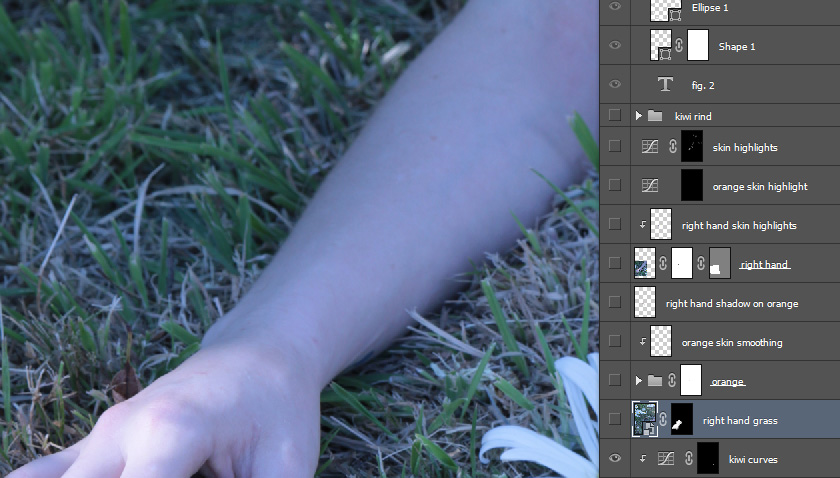
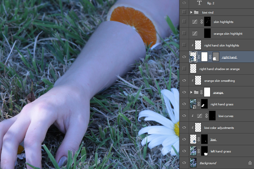
The next thing I did was add the arm back in, with a gap between the orange and the start of the rest of the arm. It makes the overall image a little less disconcerting, and it balances the image more. Having a hand there pulls it slightly out of the uncanny valley, not all the way, but enough that it no longer looks like an episode of Dexter.
Once the arm is back in though, we'll need to make sure we update the environment around it accordingly. I added a light shadow from the arm onto the orange, as well as some highlighting around the edge of the cut. This gives it a good cut off look, and really sells the separation. To add the shadows, I'm just using a layer with it's layermode set to "multiply", and some dark orange draw over it with a light and feathered brush. Remember not to use black for shadows - it will look unnatural and desaturate the area where the shadow is cast. Use a darker color of whatever you're trying to shade. For the highlights, it's a similar process, except with the layermode set to screen. Hover over the images below to toggle the shadows and highlights on and off.

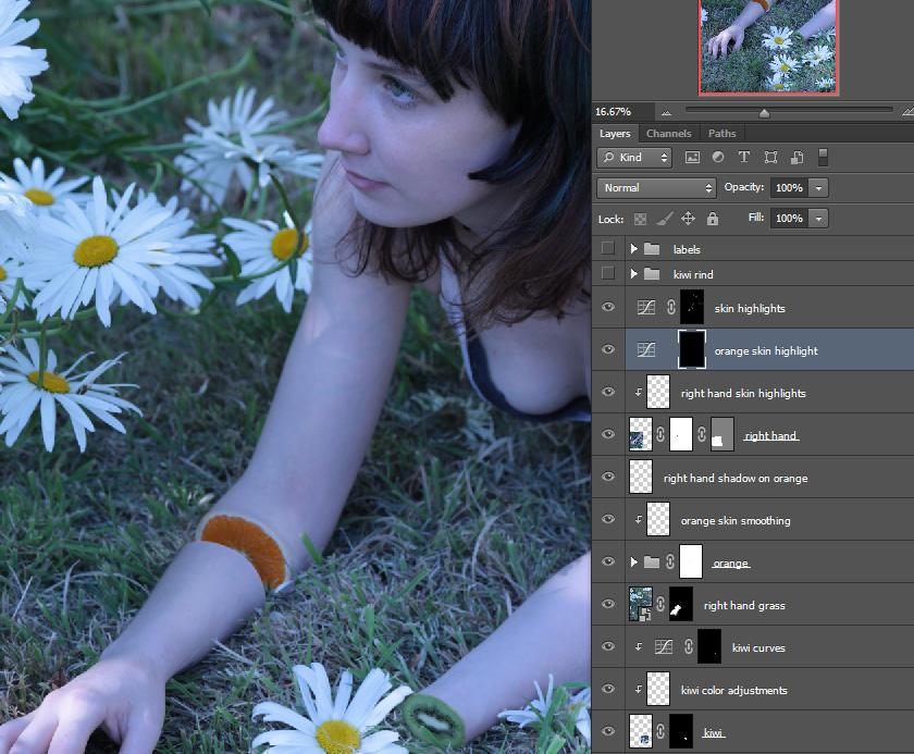
At this point, everything is detail work. It's the small, finer details that really sell something. The first thing I'm going to do is add some skin highlights. This is going to round things out a little bit and really sell the shape of things. I'm also going to bring out the eyes a little. Even though I'll be blurring them out, it's nice to have them popping in case I want to keep them later. I'm also going to lighten the rind of the orange slightly. The shape it was presenting itself with wasn't doing it for me, by lightening the edges, it'll make it look more cut off rather than just meshing into the skin. Hover below to see the highlights.

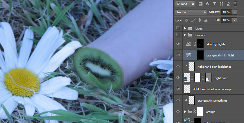
This is nearly in its finished state. I showed off this version to a few of my friends on facebook. Sam Howell, a good friend of mine from out in Hawaii, made an excellent suggestion to add a rind to the kiwi, as right now it doesn't sell the fact that there's skin around it. To do this, I copied the orange from the right arm, and used edit -> transform -> warp to finesse it into the shape of the kiwi. I then masked out the center of the orange so the kiwi flesh was showing instead, and recolored the edges of the rind using the same techniques as when we blended the kiwi rind with skin. Hover over to see the effect, I think it sells it a lot better now.

Now we move on to finishing. At this point I'll usually copy my merged composite into a new file. From there, I'll start playing with colors. In this case, I chose to tone it down a bit and make it slightly more dark. To do this, I used a black and white filter so that I could target the channels I really wanted to darken, then copied the black and white image, pasted it as a new layer, and set it to multiply. This gives it a good look and feel for a darker scene, especially with the added desaturation (remember what I said about not using black for shadows? Well here we're going to use that to our benefit).
Once I was satisfied with the colors, I copied everything that was visible (ctrl+a -> ctrl+shift+c, or command+a -> command+shift+c on a mac) then pasted it into a new layer. I then sharpened this copy heavily using filter->sharpen->unsharp mask. Unsharp mask gives you a nice amount of control when sharpening, and you can tailor it to your needs. That said, never apply sharpening to your entire image - the areas that are supposed to be smooth will start to show a lot of noise if you do this. That's why I copied everything into a new layer, so I could then use a layer mask to selectively show this sharpened layer. Hover below to see the sharpened layer applied, then click to see what the layer mask on the sharpened layer looks like. The white splotches are where the layer is visible, and the black is where it's transparent. It may seem random at first, but after a few looks you'll notice that the white splotches all are around areas where I want a strong edge or have a lot of detail. Flower petals, eyelashes, orange rinds, etc. are all things I'll target to make them pop.
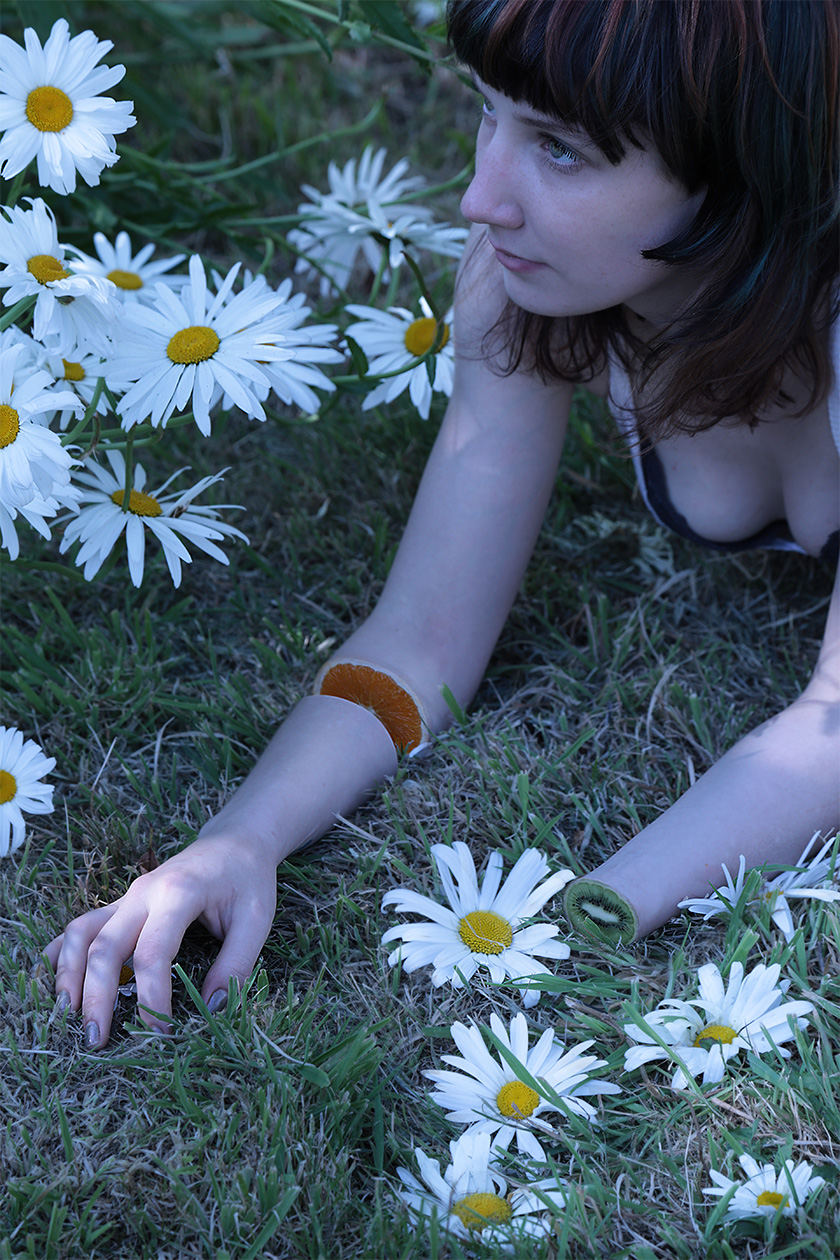
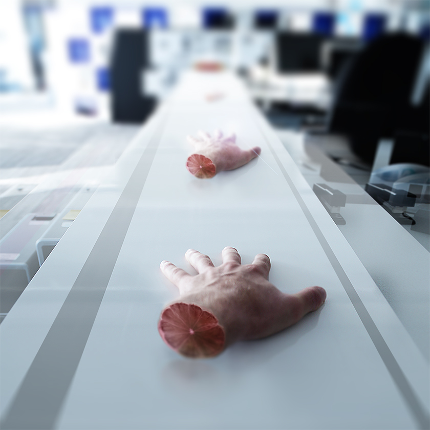
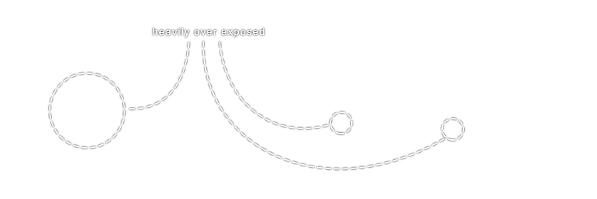
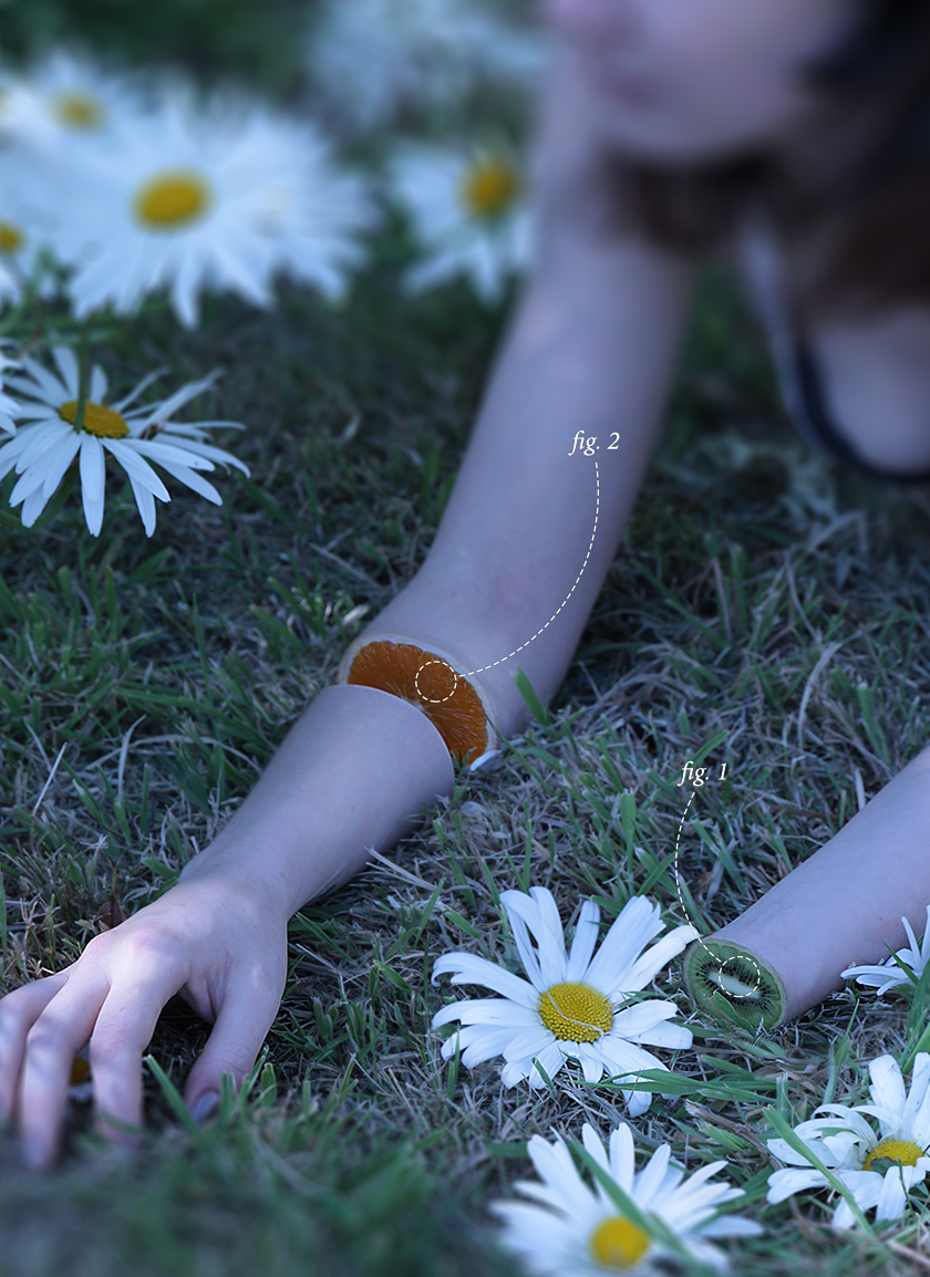
Our very last step is to crop it and blur it to direct the focal point of the image. In this case, I used a tilt-shift blur ( filter -> blur -> tilt shift ) to give it a nice depth of field look. I also added in two scientific-ey looking figure references. As I'm sure you've noticed throughout this tutorial, they really help direct the eyes well. I think they also lend to the entire composition of the piece as well, so I dropped them in as a final touch. Hover over to see the unblurred image, and the final image with the blur and the diagrams.

The feedback
After submitting this blog post around some social networks, I ended up getting a ton of feedback back from the guys on reddit's r/photography. djmykeski , aka Michael Nowicki , in particular gave me some excellent tips for recoloring the photo . Huge thanks to him for making this piece really shine. Hover over below to see the difference between his recolored version and mine. Always seek feedback from people, you'll be surprised how much better your work will turn out.
That's all folks! But feel free to download the .psd here (warning, 518MB file - please only download if you're gonna use it, as it will make my servers cry), or view the high res version (3079x4229). Also please join in on the discussion on reddit or facebook . Thanks for checking this out!
 This post, its content, and related files are released under a
Attribution 3.0 Unported license
. Feel free to share, remix, reuse, and learn from anything you see here. I'd appreciate credit, but if you don't I wont hunt you down.
This post, its content, and related files are released under a
Attribution 3.0 Unported license
. Feel free to share, remix, reuse, and learn from anything you see here. I'd appreciate credit, but if you don't I wont hunt you down.